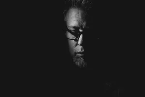
EXP 77

Inspired by Andrei Tarkovsky‘s instant photography
“In 1977, on my wedding ceremony in Moscow, Tarkovsky appeared with a Polaroid camera. He had just shortly discovered this instrument and used it with great pleasure among us. [ … ] Tarkovsky thought a lot about the ‘flight’ of time and wanted to do only one thing: to stop it — even if only for a moment, on the pictures of the Polaroid camera.”
In April 2019, I published an essay entitled I Reject the Tyranny of Precision, in which I described 1) an encounter with filmmaker Andrei Tarkovsky’s Polaroid images (1); 2) the Instax Wide experimentation that followed; and 3) my attempts at emulating instant photography, through processing, in Capture One.
There’s a lot to unpack in that post. Looking back, it’s almost a personal manifesto, foreshadowing how I’d soon view photography as a whole—as less of a document than an imprint. My feelings haven’t changed: imprecision moves me in ways perfection no longer does.
With this in mind I decided, a few months ago, to dive a bit deeper into what, exactly, excited me about the “instant look”. The goal was to expand on those initial experiments, and organize the results into a more coherent set of Capture One styles I could then use as starting points. I went back to Tarkovsky’s prints, identified a few tonal variations, and went about emulating them using C1’s grading tools. I was still working through this process when Mike, a 1EYE SOCIETY member, sent me a link to a Magnum Photos article about Jim Goldberg’s Raised by Wolves, which included a Polaroid collage from 1989. Here the colour casts weren’t always as overwhelming, the images sharper than Tarkovsky’s—much closer to the images I used to get in the late-80s with my red Cool Cam (2). So, the set grew a bit more, eventually incorporating a couple of BW looks as well.
The result is a Capture One Style Pack I’ve named EXP 77, now available as part of the 1EYE SOCIETY membership (along with everything else).


Mad Laboratory
The pack includes 11 individual styles that all tip towards intensity, but I’ve also created versions that force various crop factors: square, 4:3 and 4:5. Baking compositional changes into styles is usually a horrible idea for very logical reasons (3), and C1 even flashes a warning on every save. But I discovered that combining this with random crop positions had an interesting side effect: I could preview different compositions, simply by hovering over each style. Creatively, it’s been an interesting feature. Here’s what I mean:
These are the square versions, but the other crop factors act in the same manner. As you can see, each style is also pretty distinct, offering varying tints, curves, and levels of sharpness and grain. All of this can, of course, be easily modified, just by tweaking a few main control points, making these surprisingly versatile. In fact, I’ve lately had to stop myself from running every image though the pack. It’s a little like eating candy.
If you’re a member and have read the accompanying PDF guide, look for an upcoming Visual Dive article that will examine control points in more details, as well as how I use layers to emulate other characteristics.
The Shoebox Connection
Given my recent “hobby”, I couldn’t avoid taking the next step. Soon after receiving the HP Tango, I’d mistakenly purchased a box of HP 4x6 lustre paper (I thought it was 5x7…the box was the same size…I digress…). Not at all what I wanted, but perfect, it turns out, for faking instant prints. I did a few tests, ordered a cheap paper cutter, and boom: more pics for The Box.


…
Creating EXP 77 took longer than I first expected, but it was a fun ride about exploring possibilities. I don’t pretend to authenticity here—I was just inspired by the original material. The pack clearly stands on the wilder end of the spectrum, and it could easily devolve into something of a gimmick but, like anything, it comes down to our eye and the choices we make. It comes down to tweaks, to nuances, and also to context because some pictures will be much better suited than others to this type of processing.
But I’ll tell you this: these styles make it a lot easier to rescue outtakes and less than perfect shots…as long as you’re happy with messiness ;)
One last thing I’d like to mention: the folks behind Capture One have recently made changes to their affiliate program. I’ve always been lazy about adding links (as in I never use them) but it’s now much simpler: the code LAROQUE10 gives a 10% discount on anything (including subscriptions)—and I get a small kickback. That’s it. The code is permanent but I imagine it can only be used once per user…I don’t even know. I’m god awful at this stuff. Just an FYI if you happen to be in the market for something over there.
……………….
In 2006, Thames and Hudson published a book of these, titled Instant Light. Indigo Canada still has it listed for $27.95, but “Not currently available”. Yup… it’s a wee bit more expensive nowadays.
I wish I knew where those pictures ended up. I think an ex-girlfriend may have them.
Namely that it won’t be applied the same way, depending on a camera’s sensor size.